


You can spot a great training app from across the room. The icon is a cheerful paw, the buttons are big and thumb-friendly, and everything just feels… encouraging. That is no accident. A well-crafted dog training icon does real work: it builds trust before a user reads a single word, and it makes an app feel like a friendly coach rather than a chore list. Whether you are a trainer building your brand or just a design-curious dog lover, here is what makes training-app visuals work.
Below are five sources of icon and UI inspiration drawn from the best pet apps out there, plus practical takeaways you can apply to any dog-related project.
1. Start With Motifs Everyone Recognizes
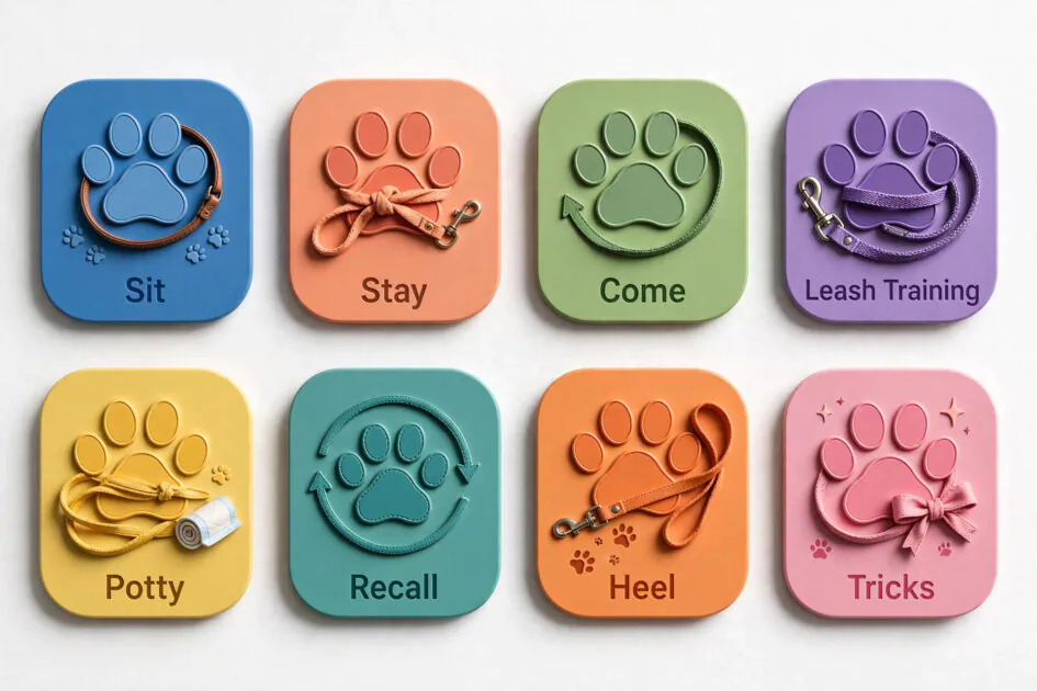
The strongest dog training icon ideas borrow from a visual language every dog owner already speaks: paw prints, leashes, whistles, treat pouches, and simple dog silhouettes. These motifs read instantly at tiny sizes, which is exactly what an app icon must do on a crowded home screen.
The trick is picking one hero motif and committing to it. A paw print merged with a checkmark says “training progress” in a single glance. A whistle wrapped in a circle suggests coaching and authority. Avoid cramming three ideas into one icon — at 60 pixels wide, complexity turns to mush. The best pet-app icons you admire all share this discipline: one clear symbol, confidently drawn.
2. Keep Shapes Bold and Simple
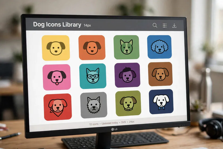
An icon has to survive being shrunk to favicon size and blown up on a billboard. That is why the most memorable dog training icon designs use bold, chunky shapes with generous spacing. Thin lines and fiddly details disappear the moment the icon gets small.
Try the squint test: shrink your design down and squint at it. If you can still tell it is a dog-related mark, you are on the right track. Flat design with two or three solid colors tends to outperform fussy gradients here, and rounded shapes feel friendlier — perfect for an industry built on positive reinforcement. Save the intricate illustration for your website hero image, where it has room to breathe.
3. Choose Colors That Feel Like Encouragement

Color sets the emotional tone before a single lesson is opened. Trustworthy blues and teals dominate pet-care apps because they signal calm reliability — exactly what a nervous first-time puppy owner wants. Energetic oranges and warm yellows add the playfulness that makes training feel fun rather than clinical.
The winning formula in most beloved training apps is a calm base color with one energetic accent reserved for calls to action: start buttons, streak flames, achievement pops. Keep text dark-on-light for readability in bright sunlight at the park. And test your palette in grayscale — if the hierarchy still works without color, your design is structurally sound.
4. Design Progress UI That Celebrates Small Wins
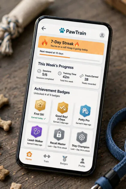
Dog training is a long game of tiny victories, and the best apps visualize every one of them. Streak counters, skill badges, level-up animations, and weekly progress rings turn “we practiced sit again” into a moment worth celebrating. This is where a dog training icon system really earns its keep — each badge becomes a collectible.
Steal this idea even if you are not building an app: trainers use printable badge charts with great success, and social media trainers post “level up” graphics when dogs master new skills. The psychology is identical. Design a consistent badge family — same shape language, escalating colors or stars — and owners will work surprisingly hard to complete the set.
5. Keep One Consistent Visual Language
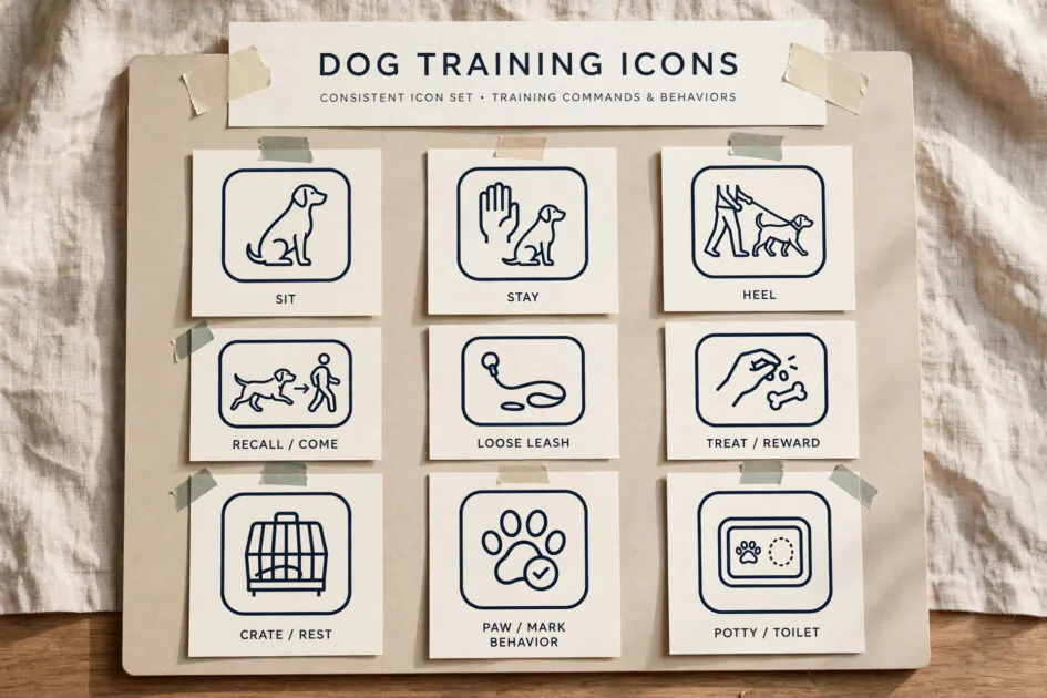
Nothing undermines trust faster than a paw icon in cartoon style next to a photorealistic whistle and a line-art leash. Consistency is what separates amateur from professional. Pick one icon family — same stroke weight, same corner radius, same palette — and use it everywhere: app, website, handouts, social templates.
Build yourself a tiny style guide, even if it is one page: your primary icon, your accent color, your button style, your headline font. Every new screen or post then takes minutes instead of hours, and your brand starts to feel inevitable. Dog owners may not consciously notice the consistency, but they feel it as professionalism — and professionalism is what gets a trainer hired.
FAQs
What makes a good dog training app icon?
One instantly recognizable dog-related motif, bold simple shapes that read at small sizes, and a friendly color. If a stranger can guess it is a dog app from the icon alone, it works.
Which colors work best for pet app design?
Calm blues and teals for trust, with warm orange or yellow accents for energy and calls to action. Avoid aggressive reds except for warnings.
Should training app icons be flat or 3D?
Flat or lightly dimensional. Fully 3D icons often lose clarity at small sizes, while flat shapes stay crisp and feel modern and approachable.
Where can I find icon inspiration?
Study top-rated pet apps in the app stores, browse icon libraries like Font Awesome’s pet sets, and save screenshots of onboarding flows you admire. Inspiration, not imitation.
How many icons does a training app need?
Start with a core family of 8 to 12: home, lessons, progress, badges, calendar, treats log, video, settings, plus your app icon. Expand only when a new feature truly needs one.
Conclusion
A great dog training icon is small but mighty: it signals trust, sparks joy, and makes an app feel like a coach in your pocket. Borrow familiar motifs, keep shapes bold, choose encouraging colors, celebrate progress visually, and stay consistent. Whether you are designing an app or just admiring good work, you will never look at a paw-print icon the same way again.