
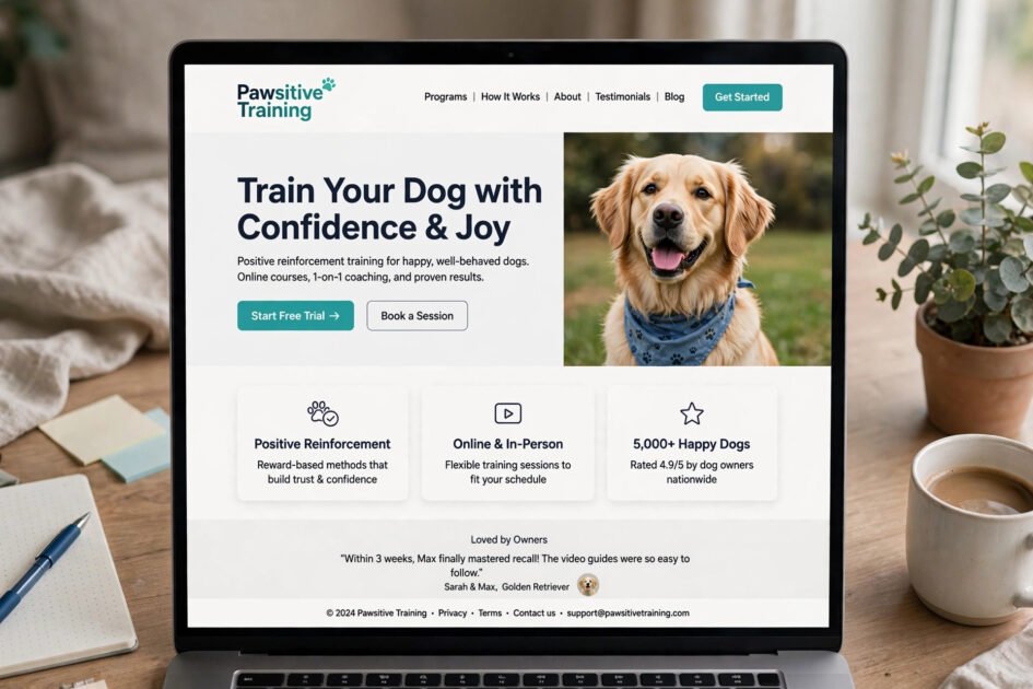

A dog owner with a pulling, jumping, barking pup does not browse training websites for fun — they arrive stressed and hoping you are the answer. The best dog training design ideas understand this: every pixel should say “we can help, and it will be easy.” Whether you are a trainer building your online home or a dog lover who appreciates good design, here is what separates websites and apps that convert from ones that just sit there.
These five ideas cover the pages and screens that matter most, with practical details you can steal for any dog-related project.
1. Lead With a Hero That Shows Real, Happy Dogs

Your hero section has about three seconds to answer one question: “Is this for me and my dog?” Stock photos of generic puppies do not answer it. Real photos of real dogs mid-training — focused, joyful, clearly learning — do. Pair the image with one clear headline stating the outcome you deliver, like “From chaotic walks to calm heels in 6 weeks,” and a single prominent button.
Resist the urge to cram your life story above the fold. One image, one promise, one action. Video heroes can work beautifully here — ten seconds of a reactive dog transforming into a focused partner is worth a thousand words — but keep it short, muted by default, and fast-loading. If it takes more than three seconds to load, you have lost the stressed owner who needed you most.
2. Make Booking and Pricing Dead Simple

Nothing kills conversions like a “Contact us for pricing” wall. Dog owners comparison-shop at midnight while their puppy chews the couch; if your site makes the next step hard, they will bounce to a competitor. Show your core packages with plain-language names, honest prices, and what is included in each.
The booking flow itself should take under two minutes: pick a service, pick a time, enter details, done. Every extra field or confusing step costs you clients. In apps, the equivalent is a frictionless onboarding — three taps from download to first lesson. Add trust signals near the price (certifications, review counts, guarantee badges) to melt last-minute hesitation. Simple does not mean cheap-looking; it means respectful of the visitor’s time.
3. Design Lesson Pages for Skimming
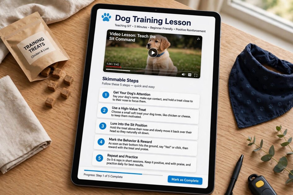
Owners do not read training content like novels — they skim it with one eye on a misbehaving dog. Lesson pages and app screens should be built for scanning: short paragraphs, numbered steps, bolded key cues, and a video or GIF demonstrating each exercise. If someone cannot grasp the lesson in fifteen seconds of scrolling, the layout has failed.
Structure every lesson the same way so users learn the rhythm: goal, what you need, step-by-step, common mistakes, and a quick troubleshooting box. Progress indicators (“Lesson 3 of 12”) keep motivation alive, and a prominent “mark complete” button delivers the dopamine hit that brings people back tomorrow. Consistency across lessons matters as much as the content itself.
4. Let Testimonials and Transformations Sell for You

Claims are cheap; proof is persuasive. A wall of specific testimonials — with dog names, breeds, and the exact problem solved — outperforms any marketing copy you could write. Even better: before-and-after stories. “Bella used to lunge at every dog on walks. After four sessions…” paired with photos or short clips is irresistible.
Design these for credibility, not polish. Real phone photos and unscripted quotes beat studio gloss, because stressed owners are looking for someone relatable, not perfect. Include star ratings, the trainer’s certifications, and if you have them, numbers: dogs trained, years of experience, success rate. In apps, surface this social proof during onboarding and near every paywall — it is the nudge that turns a trial into a subscription.
5. Go Mobile-First — Owners Browse at the Park
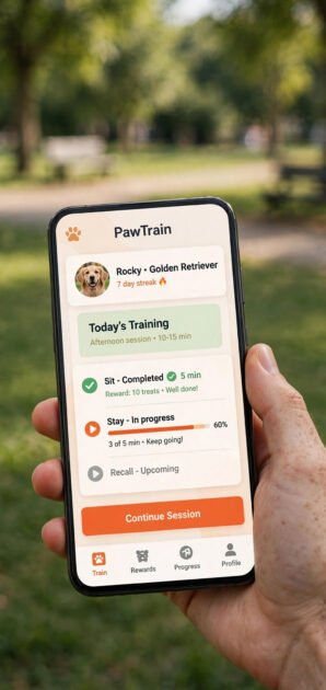
Here is the reality: a huge share of your visitors are on phones, often standing in a park with a dog in one hand. If your site is not flawless on mobile, it is broken. Buttons must be thumb-sized, text readable without pinching, and the booking flow completable one-handed.
For apps this is table stakes, but websites need the same discipline: stack content vertically, collapse navigation into a clean menu, and make the phone number tap-to-call. Test on a real phone in bright sunlight — if you cannot read it or tap it there, redesign it. Speed matters doubly on mobile data, so compress images ruthlessly. The trainer whose site works perfectly at the park wins the client standing in that park.
FAQs
What should a dog trainer’s homepage include?
A clear headline with the outcome you deliver, a hero image of real training, your core services with prices, testimonials, credentials, and one prominent booking button. Keep it focused and fast.
Do dog training apps really need video lessons?
Yes — training is physical and visual. Short demonstration videos dramatically outperform text-only instructions for teaching timing, body language, and mechanics.
How important is mobile design for trainer websites?
Critical. Most owners browse on phones, often outdoors. A site that is awkward on mobile will lose the majority of its potential clients.
Should I show prices on my training website?
Almost always yes. Transparent pricing builds trust and filters out mismatched inquiries, saving you time. You can keep premium or custom programs as “contact for details.”
What is the biggest website mistake trainers make?
Burying the booking button and talking about themselves instead of the owner’s problem. Lead with the transformation you offer, make the next step obvious, and keep everything else secondary.
Conclusion
The best dog training design ideas all serve one goal: turning a stressed visitor into a confident client as smoothly as possible. Show real dogs, simplify booking, design for skimmers, prove your results, and build mobile-first. Get those five right, and your website or app will not just look good — it will work as hard as you do.