
Your logo is the first handshake your dog training business ever makes. Before a client reads a single review or watches one training video, they have already judged your brand by that little mark in the corner of your website. That is why great dog training logo ideas matter so much. The right logo tells people you are professional, trustworthy, and genuinely great with dogs, all in a single glance.
But here is the problem: most trainer logos look exactly the same. A generic paw print, a stock dog silhouette, done. If you want clients to remember you, and pay premium prices, your logo needs personality and strategy behind it. Below are five logo directions worth exploring, each with practical tips to make the concept unmistakably yours.
1. Paw Print Marks With a Twist
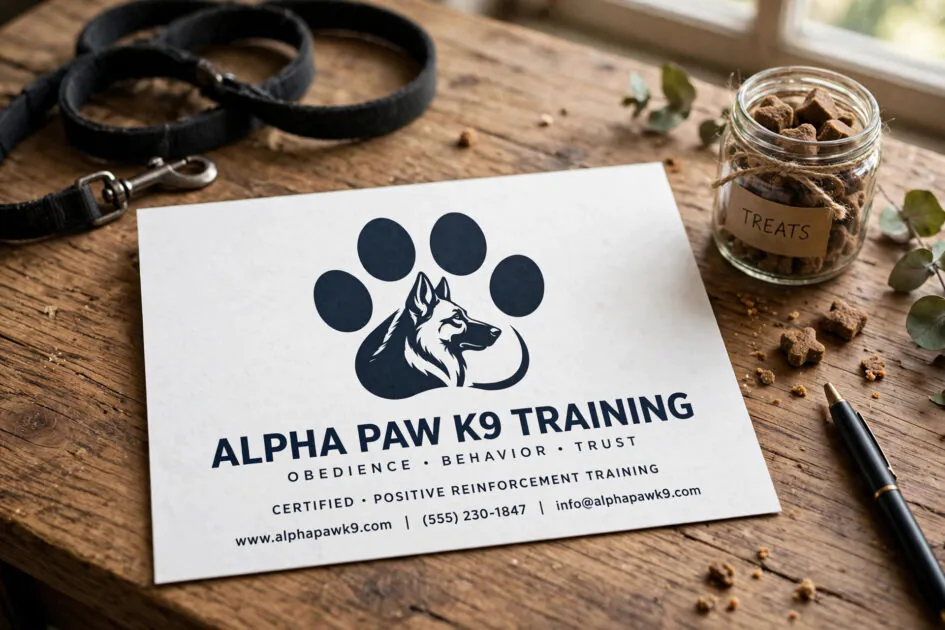
The paw print is the classic dog business symbol for a reason: it is instantly recognizable. The trick is to avoid the clip-art version everyone else uses. Try merging the paw with another meaningful shape, like a whistle, a leash loop, or the silhouette of your signature breed. Negative space can do heavy lifting here, with the gaps between the toes forming a subtle heart or star.
Keep the mark bold enough to read at favicon size. If your paw disappears into a blob on a phone screen, simplify it. One strong, ownable paw beats a detailed illustration every time, and it embroiders beautifully on staff polos and training vests too.
2. Minimalist Line-Art Logos
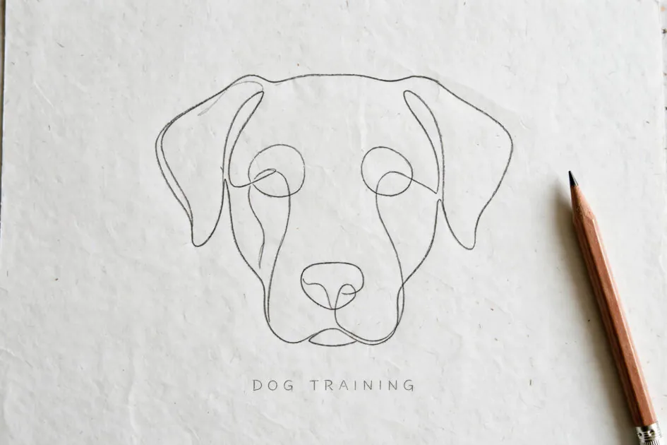
Nothing says modern and premium like a single continuous line that draws a dog’s face, a sitting pup, or a trainer’s hand offering a treat. Minimalist line-art logos feel calm and confident, which is exactly the energy nervous first-time clients want from a trainer. They also reproduce flawlessly everywhere, from website headers to van decals to tiny social avatars.
The risk with minimalism is looking generic, so give your line drawing one distinctive feature: an unusual ear angle, a collar detail, or an unexpected breed choice. Pair it with clean, modern typography and plenty of white space, and your brand will look like the premium option in your market even if your prices are mid-range.
3. Badge and Emblem Logos That Build Trust
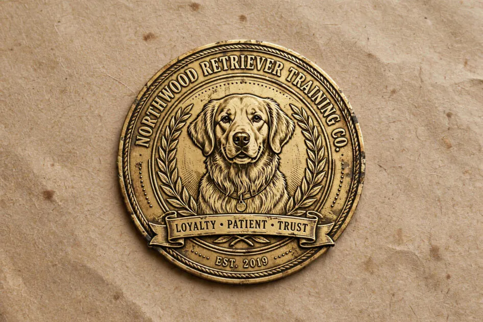
Badge and emblem logos borrow the visual language of heritage, craftsmanship, and authority. A circular badge with your business name curved around a retriever illustration and a ribbon banner underneath instantly communicates experience. This style works beautifully for board-and-train facilities, working-dog trainers, and anyone whose selling point is proven results.
To keep a badge from feeling dated, balance the vintage structure with contemporary touches: a limited two-color palette, a modern sans-serif for the name, or a slightly abstract dog illustration instead of a realistic one. Badges also adapt wonderfully to merchandise, stickers, and vehicle wraps, turning every client touchpoint into brand advertising.
4. Playful Mascot Logos Full of Personality
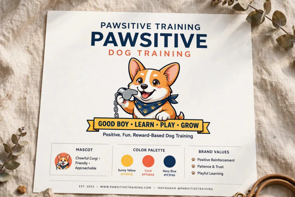
If your ideal clients are families with bouncy puppies, a mascot logo can be pure gold. A cheerful cartoon corgi with a whistle, a clever border collie mid-trick, or a goofy rescue mutt gives your brand instant warmth and memorability. Mascots photograph well on social media, make great stickers for puppy class graduates, and give kids something to love.
The key is committing fully. A half-hearted mascot looks amateur, so invest in a professional illustrator and define the character’s personality: is it encouraging, mischievous, or wise? Use the mascot consistently across your website, handouts, and social posts, and it becomes a brand asset competitors cannot easily copy.
5. Monogram and Wordmark Logos
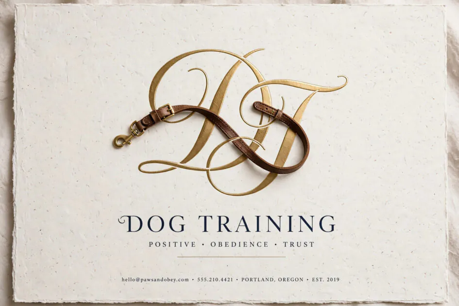
Sometimes the strongest mark is simply beautiful typography. A monogram that weaves your initials together, perhaps with a leash curve flowing through the letters, feels refined and timeless. Wordmark logos put your business name front and center, which is a genuine advantage when you are still building name recognition in your local market.
Typography-first logos demand excellent type choices. Avoid overused script fonts and free fonts everyone recognizes. A custom or carefully modified letterform, paired with one small dog-related detail like a collar dot over an “i”, gives you a logo that looks established from day one and never goes out of style.
FAQs About Dog Training Logos
How much should a dog training logo cost?
A professional logo from a freelance designer typically runs $300 to $1,500, while a full brand identity package can reach $2,500 or more. Avoid $5 logo mills; a forgettable mark costs you far more in lost clients than a good designer ever will.
Should my logo feature my own dog?
It can be a lovely personal touch, especially for solo trainers whose personality is the brand. Just make sure the illustration still reads clearly at small sizes, and consider whether you want the brand tied to one specific dog long-term.
What file formats do I need from my designer?
Ask for vector files (AI or EPS) plus high-resolution PNGs with transparent backgrounds, and versions in full color, single color, and reversed (white). You will need every one of these across print, web, embroidery, and vehicle graphics.
Can I design my own logo instead of hiring someone?
You can, but be honest about your design skills. A DIY logo often signals DIY service quality to premium clients. If budget is tight, hire a designer for the core mark and handle simpler templates yourself.
How do I know if my logo is actually working?
Test it brutally: shrink it to favicon size, print it in black and white, and show it to five strangers for three seconds. If they remember it and guess “dog business,” your logo is doing its job.
The Bottom Line
The best dog training logo ideas are not about following trends; they are about matching the mark to the business you want to build. Pick the direction that fits your personality and your ideal client, invest in professional execution, and use it everywhere. A strong logo will not train a single dog for you, but it will make every marketing dollar work harder.